Introduction
In today’s digital age, data is everywhere. Whether in news reports, business presentations, or social media posts, graphs and charts are frequently used to present information in a visually compelling way. While data visualization is a powerful tool, it can also be manipulated to mislead audiences. Misleading graphs distort reality, often exaggerating or minimizing trends to push a specific narrative.
Misleading graphs can result from intentional deception or unintentional design flaws. Regardless of the intent, these distortions can have serious consequences, influencing public opinion, shaping policies, and even affecting financial decisions. In this article, we will explore the common techniques used to create misleading graphs, real-world consequences of data distortion, and how to identify and avoid falling victim to deceptive visuals.
Common Ways Graphs Mislead

Manipulating the Y-Axis
One misleading of the most common ways graphs mislead is by manipulating the Y-axis, which represents the numerical values in a graph. By adjusting the Y-axis scale, data can be exaggerated or downplayed to create a misleading impression.
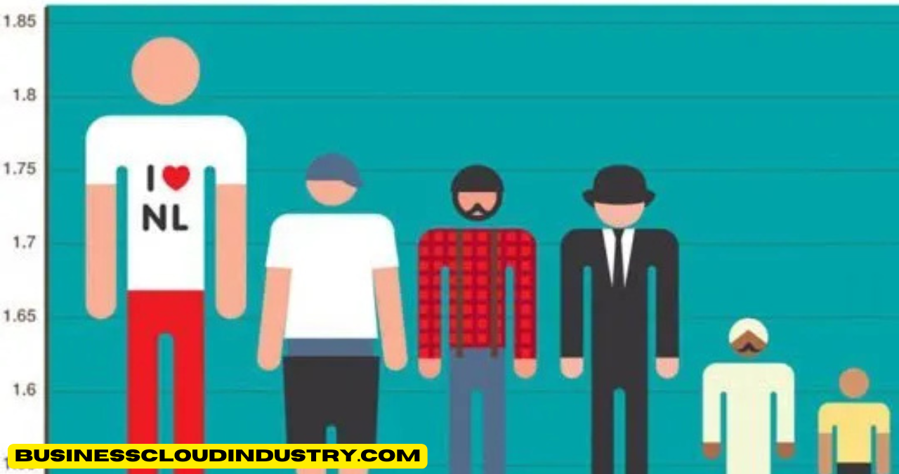
For instance, when the Y-axis does not start at zero, small differences in data can appear much larger than they actually are. A bar graph comparing two products’ sales might show one bar as significantly taller than the other, suggesting a major disparity, when in reality, the difference is minor. This technique is often used in financial reports and political campaigns to emphasize or downplay changes.
On the other hand, expanding the Y-axis scale can make significant differences appear insignificant. This is commonly seen in stock market trends, where a broad Y-axis range can make volatile fluctuations seem stable. By carefully selecting the Y-axis range, data visualizations can manipulate perceptions and mislead audiences.
Cherry-Picked Data and Skewed Scales
Cherry-picking data involves selecting only specific data points that support a particular narrative while ignoring the full dataset. This technique is widely used in marketing, politics, and scientific research to sway opinions.
For example, a climate change graph might only display temperature changes from a particularly cold decade, misleading viewers into believing global warming is not a concern. Similarly, a company might showcase only its best-performing months in a sales report, hiding seasonal declines.
Skewed scales further contribute to distortion. Using a logarithmic scale instead of a linear scale without proper labeling can confuse viewers. Logarithmic scales compress large differences, making significant variations appear small. This can be useful in scientific contexts but misleading in public-facing charts if not properly explained.
Misleading Visual Elements
The way a graph is designed can significantly influence perception. Three-dimensional graphs, for instance, often distort data by making certain bars or segments appear larger than they actually are due to perspective. The use of bright colors, shadows, and gradients can also create optical illusions that manipulate interpretation.
Another misleading technique involves using area or volume to represent data rather than length. A common example is pie charts where one slice appears disproportionately large due to an exaggerated perspective. Similarly, bubble charts can mislead if the area of the bubbles does not accurately correspond to the data they represent.
Improper Use of Statistical Methods
Statistical misrepresentation is another way graphs deceive audiences. Trendlines that exaggerate patterns, misleading averages, and correlation-causation confusion are common tricks used to manipulate data.
For example, a graph might depict an upward trend without showing the full dataset, implying that the trend is consistent when, in reality, the data fluctuates. Similarly, using averages instead of medians in income reports can misrepresent economic disparities by masking extreme values.
Graphs that suggest causation when only correlation exists are particularly deceptive. Just because two variables appear related does not mean one causes the other. For example, a graph showing an increase in ice cream sales alongside an increase in drowning incidents might suggest a causal relationship, when in reality, both are influenced by a third factor: hot weather.
Real-World Consequences of Misleading Graphs
Impact on Public Opinion and Policy
Misleading graphs have far-reaching implications in shaping public opinion and influencing policies. Politicians and media outlets often use distorted graphs to manipulate voters. A candidate might showcase a selective unemployment graph, excluding certain years to make their term appear more successful. Similarly, media organizations may present skewed statistics to sensationalize stories and drive engagement.
Social media exacerbates the problem by allowing misleading graphs to spread rapidly. Misinformation campaigns often use deceptive data visualizations to support conspiracy theories, distort scientific facts, or incite public fear. When widely shared, such graphs contribute to societal polarization and misinformation.
Business and Financial Misrepresentation
In the corporate world, misleading graphs can deceive investors and consumers. Businesses may manipulate financial reports by adjusting scales, omitting key data points, or presenting misleading comparisons. Stock market reports frequently use visual tricks to create an illusion of stability or growth, influencing investor decisions.
Marketing teams also use misleading graphs to enhance product appeal. For example, a skincare company might present a bar chart showing a 90% improvement in skin health, but a closer look at the fine print reveals that the study had a tiny sample size. Such tactics prey on consumers’ trust in data, leading to misinformed purchasing decisions.
Scientific and Healthcare Misinformation
In the medical and scientific fields, misleading graphs can have serious consequences. Research studies sometimes use selective data presentation to exaggerate findings. Pharmaceutical companies might showcase only the positive effects of a drug while downplaying side effects through scale manipulation.
Public health crises, such as the COVID-19 pandemic, have highlighted how misleading graphs can impact decision-making. Misrepresentation of infection rates, vaccine efficacy, and death tolls has fueled public confusion and mistrust. Ethical data presentation is crucial in these fields to ensure accurate information reaches the public.
How to Identify and Avoid Being Misled
Critical Thinking and Visual Literacy
To avoid falling for misleading graphs, critical thinking and visual literacy are essential. Always question who created the graph and why. Look for clear axis labeling, check for truncated Y-axes, and analyze whether data has been cherry-picked. Comparing multiple sources helps verify authenticity.
Best Practices for Ethical Data Visualization
Ethical data presentation requires transparency. Graph creators should use proper scaling, provide full datasets, and avoid exaggerated visual effects. Providing context, such as labeling logarithmic scales or citing data sources, ensures clarity.
Tools and Resources for Detecting Misleading Graphs
Several tools help identify misleading graphs. Software like Excel, Tableau, and Python libraries (Matplotlib, Seaborn) allow users to analyze raw data. Fact-checking organizations, such as Snopes and PolitiFact, also assess misleading statistics.
Conclusion
Misleading graphs are a powerful tool for deception, capable of distorting public opinion, influencing policies, and driving financial decisions. Recognizing these tricks is crucial in an era where data drives decision-making. By developing critical thinking skills and advocating for ethical data visualization, we can ensure accurate and honest data representation.